There is a rather vague characteristic called Eye Appeal that coin graders assess when examining coins. Everyone knows about grading: coins are evaluated by experts who assign a numerical rating to the coin which represents the level of wear and overall level of quality. When evaluating circulated coins the level of wear is the main concern. The amount of remaining detail will pigeon-hole the coin into one of the broad grade categories used for circulated examples: Poor, Fair, About Good, Good, Very Good, Fine, Very Fine, Extremely Fine, and About Uncirculated. Once a coin is deemed to be Uncirculated (or Mint State), further assignment of a precise numerical grade is determined through consideration of four general quality parameters: Luster, Strike, Contact Marks, and Eye Appeal. By weighing the coin’s quality according to these factors the grader will pick the appropriate MS grade which will range from MS-60 to MS-70. An MS-60 coin must show no wear but will have impaired luster, a poor strike, excessive contact marks, substandard eye appeal, or some combination of these negative qualities. An MS-70 coin must have superior quality for all these parameters. According to the PCGS grading standards webpage, an MS-70 coin must also be “free of visual marks.”
Of these four quality factors, Eye Appeal is perhaps the most subjective. It is somewhat like a beauty contest scenario: how attractive is the particular coin to the grader? Is it a coin that is pleasing to the eye, such that the grader would consider adding it to their collection? Is it free of negative appearance factors, such as spotting, unattractive toning, signs of improper cleaning, or distracting surface marks? Would it attract strong bids if offered at auction? Does it stand out (in a good way!) if presented alongside a group of similar coins? If the answer to all these questions is “Yes” then the coin has positive eye appeal and that quality would likely contribute to a higher assigned grade.
Eye appeal will often determine collector preference for one coin over another. If grading were an exact science you could expect that two examples of a specific coin that have been given the same grade by the same grading expert would have equal eye appeal. In the real collecting world, however, this is frequently not the case. Coins with the same numerical grade can sell for significantly different prices, simply because collectors prefer the “look” of one coin over the other. This situation is common, even when the two coins in question have been graded by the same third-party grading service.
Consider the following images of two different 1890-CC Double Eagle gold coins. Both are graded AU-58 by PCGS grading service. Only obverses are shown. The first image is a photo I took using my digital camera. The second image was copied from the Heritage Auctions website. The camera settings and photo setups were obviously not the same, but there are clear differences between the two coins which cannot be attributed to differences in photographic technique or equipment.
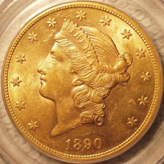
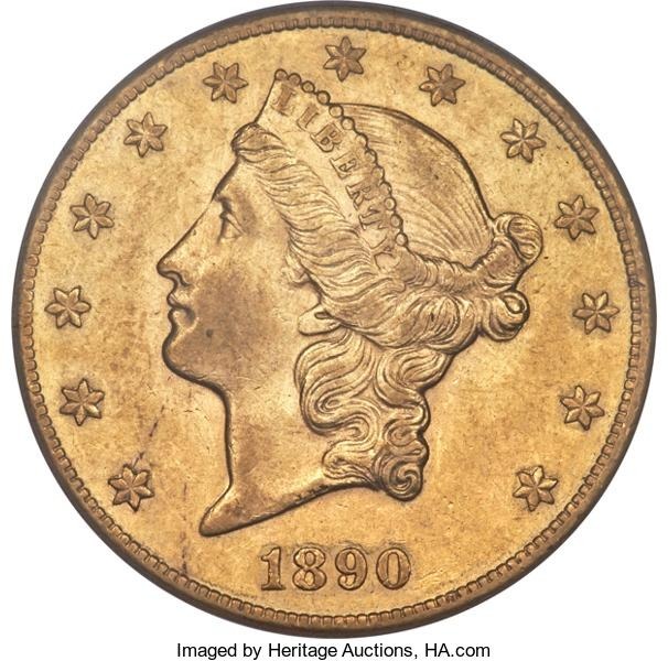
The first coin has a “clean” cheek with no rub. Substantial luster is visible in the fields, particularly near Liberty’s face and above and behind her head. Very little evidence of wear is present. The radial lines on all the stars are sharp. There is slight weakness to the tops of the letters in LIBERTY but there is no clear sign of friction there. The second coin shows virtually no luster and has definite visible friction on the cheek, neck, and in the fields. The tops of several letters in LIBERTY appear to show wear. The star radial lines are all visible but are not as crisp as for the first coin. Some of these detail differences could be attributed to strike quality but the overall impression is that Coin #2 has seen more circulation than Coin #1.
So, we have two coins, same date and mint, same denomination, same grade, same grading service. I consider the first to have far better eye appeal and therefore would strongly prefer it for my collection. This is a perfect example of the old adage, “buy the coin, not the slab”.
Let’s consider one more pair of coins with identical grades but unequal eye appeal. These are 1923 Standing Liberty quarters. Only the reverses are shown and in this case only black and white photos are provided. The first coin is graded AU-58 by PCGS. The second is graded AU-58 by ANACS. Which of these two looks like the better coin?
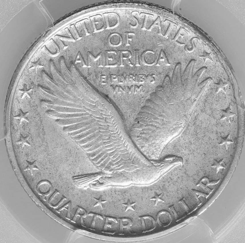
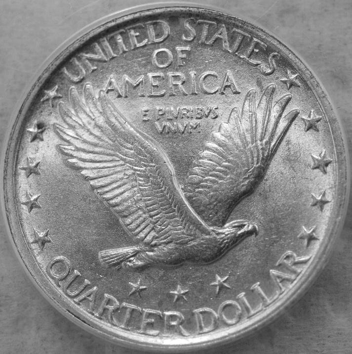
The first quarter shows loss of detail on the eagle’s right (facing) wing, neck, and breast. Feather detail is weak, either due to actual wear or to strike weakness. The stars on the reverse of Standing Liberty quarters don’t really have radial lines, but these elements on this coin appear to have rather poor definition. Very little luster is evident. The second coin shows sharper detail in all areas and retains much stronger luster. The stars clearly are more sharply defined. There is a noticeable dark spot by Star #4 near the left-side rim which is a slight negative. However, otherwise this quarter has only positive attributes. Although PCGS has the better reputation as a grading service, in this case I’d judge that the ANACS-graded coin is the clear winner in terms of overall appeal.
The takeaway from this essay is that the assigned numerical grade is only part of the story when you evaluate coins. Eye appeal is different for every coin and the astute collector will take these important differences into account when making buying decisions.